Totally Landscapes
Totally Landscapes
A user-focused redesign that simplifies journeys, enhances credibility and makes discovering services effortless.
PROJECT TYPE
2025
Scope
Branding
Timeline
8 weeks
The Challenge
The previous website grouped services loosely, making it difficult for users to quickly understand what Totally Landscapes offered and which services were relevant to them.
The previous website grouped services loosely, making it difficult for users to quickly understand what Totally Landscapes offered and which services were relevant to them.
The previous website grouped services loosely, making it difficult for users to quickly understand what Totally Landscapes offered and which services were relevant to them.
Content was heavily text led with limited hierarchy, resulting in poor scannability and unclear value propositions. Visuals were inconsistent, and enquiry points were often disconnected from service context. The challenge was to redesign the site as a clear, service driven experience that showcased expertise while supporting fast decision making.
Content was heavily text led with limited hierarchy, resulting in poor scannability and unclear value propositions. Visuals were inconsistent, and enquiry points were often disconnected from service context. The challenge was to redesign the site as a clear, service driven experience that showcased expertise while supporting fast decision making.
Content was heavily text led with limited hierarchy, resulting in poor scannability and unclear value propositions. Visuals were inconsistent, and enquiry points were often disconnected from service context. The challenge was to redesign the site as a clear, service driven experience that showcased expertise while supporting fast decision making.

Low Confidence at Decision Points
A lack of supporting visuals and outcome focused copy reduced trust, particularly for higher value commercial enquiries.

Unclear Service Differentiation
Users struggled to distinguish between one off landscaping projects and ongoing maintenance services. This led to confusion around suitability and pricing expectations.

Inconsistent Conversion Pathways
Calls to action varied across pages and were often positioned without enough reassurance or clarity, creating friction before contact.
Audience and Insights
Audience and Insights
Unclear Service Differentiation
An Experience That Felt Fragmented
Users struggled to distinguish between one off landscaping projects and ongoing maintenance services. This led to confusion around suitability and pricing expectations.
Users struggled to distinguish between one off landscaping projects and ongoing maintenance services. This led to confusion around suitability and pricing expectations.
Low Confidence at Decision Points
Unclear Conversion Pathways
A lack of supporting visuals and outcome focused copy reduced trust, particularly for higher value commercial enquiries.
A lack of supporting visuals and outcome focused copy reduced trust, particularly for higher value commercial enquiries.
Inconsistent Conversion Pathways
Outdated Structure and Limited Clarity
Calls to action varied across pages and were often positioned without enough reassurance or clarity, creating friction before contact.
Calls to action varied across pages and were often positioned without enough reassurance or clarity, creating friction before contact.
IDEATION AND APPROACH
The ideation phase focused on reframing the site around user intent rather than company structure.
The ideation phase focused on reframing the site around user intent rather than company structure.
The ideation phase focused on reframing the site around user intent rather than company structure.
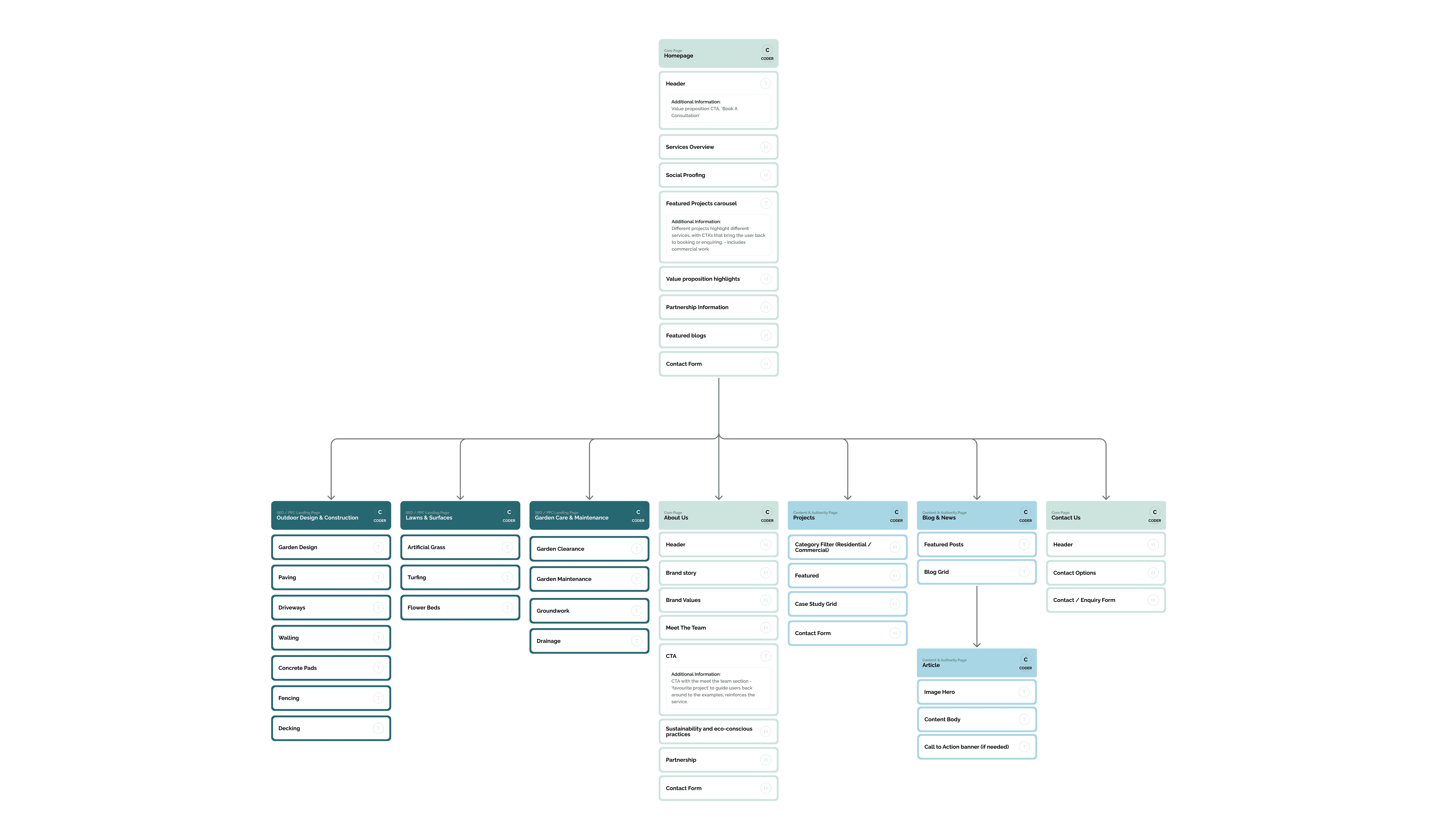
Services were mapped into clear categories based on project type, audience and engagement length. Early concepts explored modular page layouts that paired strong imagery with concise explanatory copy, allowing users to quickly assess relevance. Navigation was simplified to prioritise top level services, with deeper detail revealed progressively to support informed decision making.
Services were mapped into clear categories based on project type, audience and engagement length. Early concepts explored modular page layouts that paired strong imagery with concise explanatory copy, allowing users to quickly assess relevance. Navigation was simplified to prioritise top level services, with deeper detail revealed progressively to support informed decision making.
Services were mapped into clear categories based on project type, audience and engagement length. Early concepts explored modular page layouts that paired strong imagery with concise explanatory copy, allowing users to quickly assess relevance. Navigation was simplified to prioritise top level services, with deeper detail revealed progressively to support informed decision making.

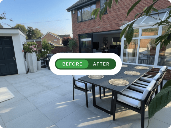
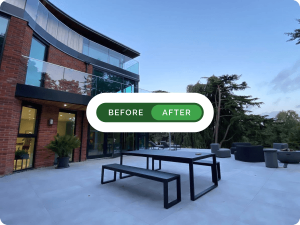
The visual system leaned into simplicity and confidence. Large imagery was used to demonstrate outcomes and craftsmanship, supported by restrained typography and consistent spacing. Content blocks were designed to be repeatable across services, creating a predictable rhythm that reduced cognitive load.
The visual system leaned into simplicity and confidence. Large imagery was used to demonstrate outcomes and craftsmanship, supported by restrained typography and consistent spacing. Content blocks were designed to be repeatable across services, creating a predictable rhythm that reduced cognitive load.
I introduced a structured research and testing process, using early validation and rapid iteration to guide decisions, reduce risk and ensure the experience evolved around real user behaviour rather than assumptions.
Testing and Evaluation
Testing and Evaluation
31%
Faster Access to Relevant Services
Users reached appropriate service pages more efficiently, validating the revised information architecture.
42%
Increase in Enquiry Engagement
Improved storytelling and clearer calls to action led to a noticeable uplift in contact interactions across service pages.
68%
Increase in Scroll Depth & Interaction
Users engaged more deeply with content, indicating that the balance between imagery and copy encouraged exploration without overwhelm.
29%
Faster Product Configuration
Users completed custom kit builds more quickly once options were grouped into clear stages, reducing backtracking and hesitation during high-commitment steps.
22%
Increase in Completed Enquiries
Introducing clearer reassurance points and a structured journey improved confidence, leading to more users completing enquiries without dropping out.
38%
Improvement in Product Understanding
Clearer hierarchy, progressive disclosure and consistent specifications helped users understand differences between options and make decisions with greater certainty.
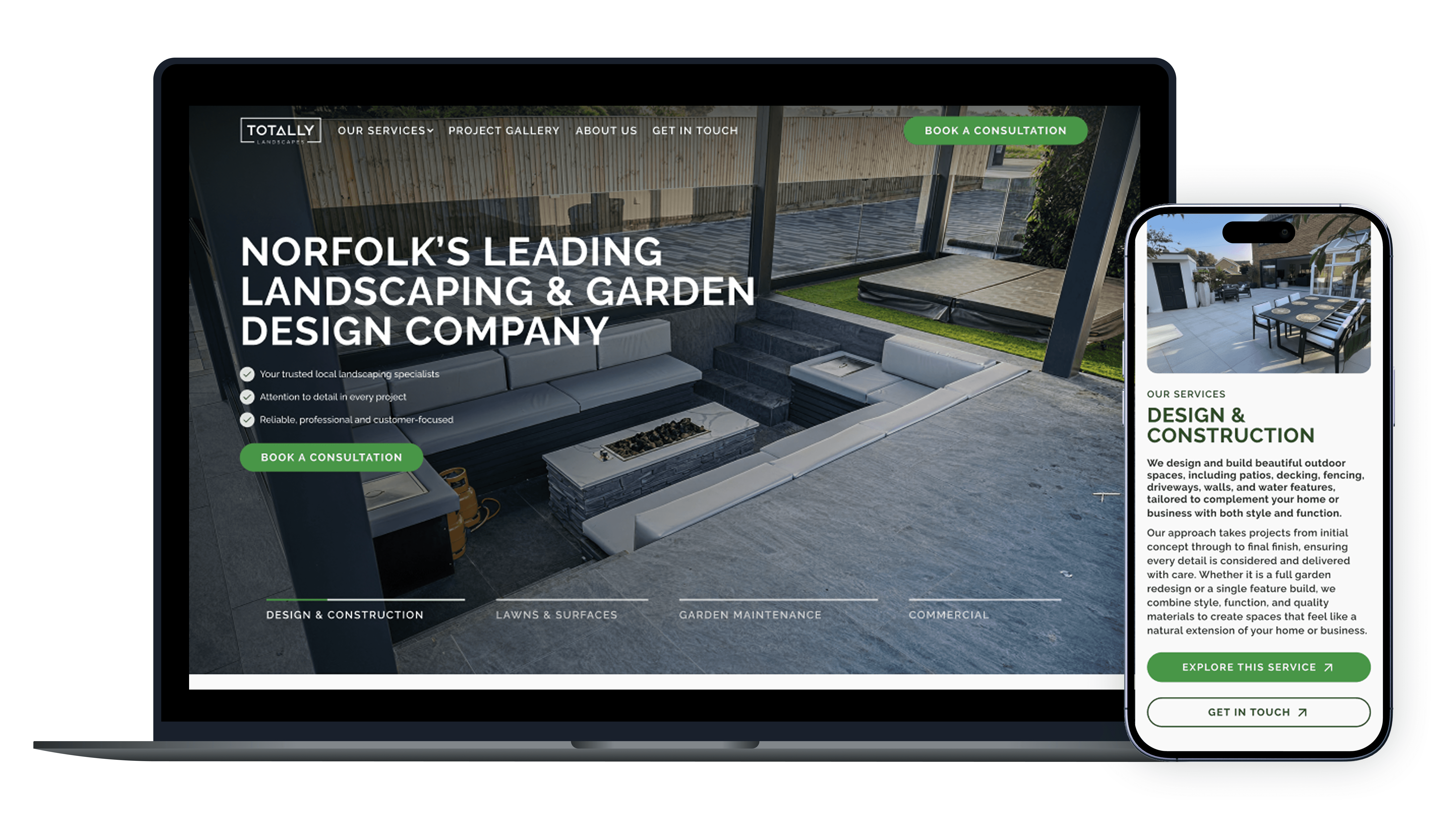
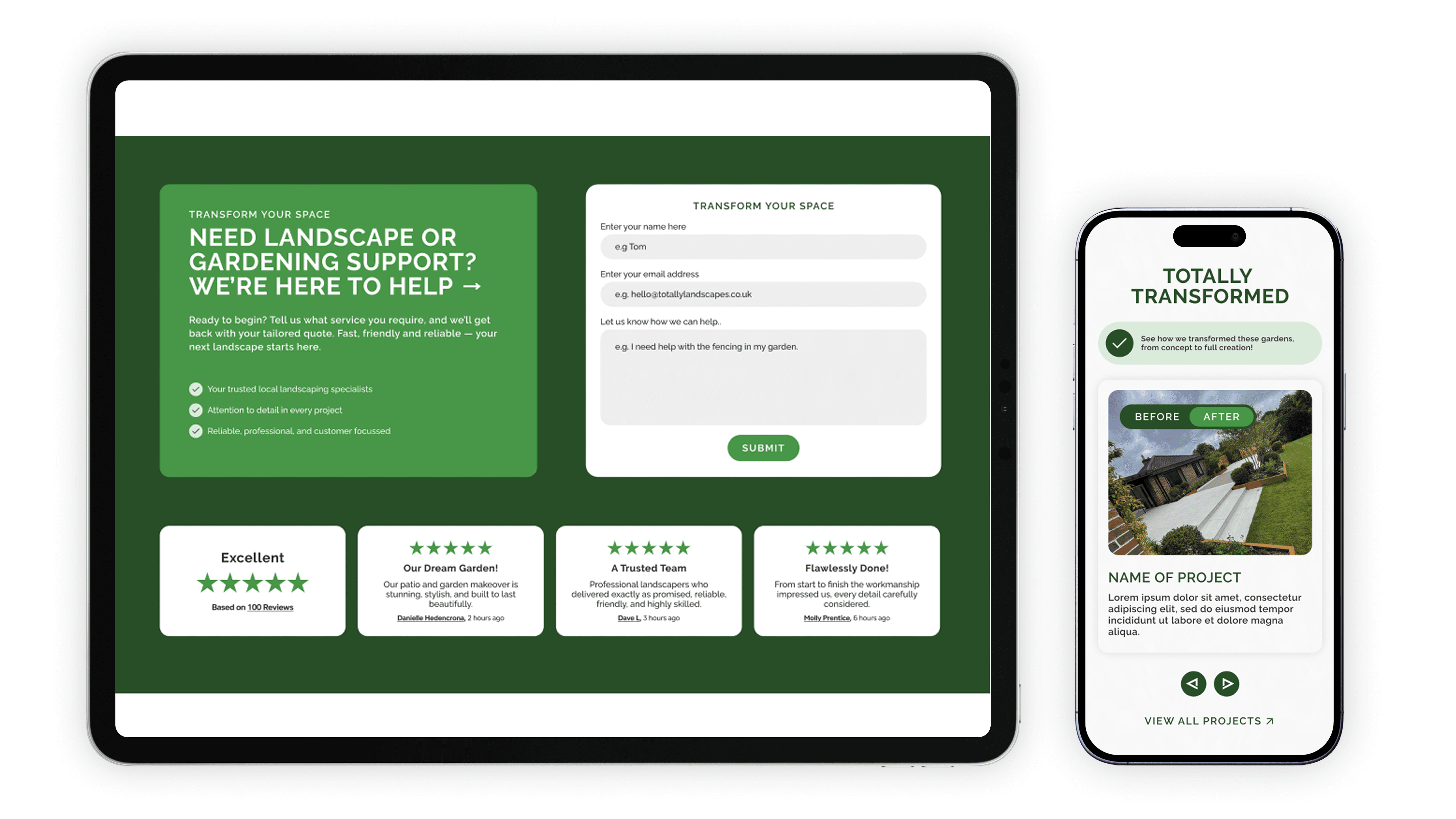
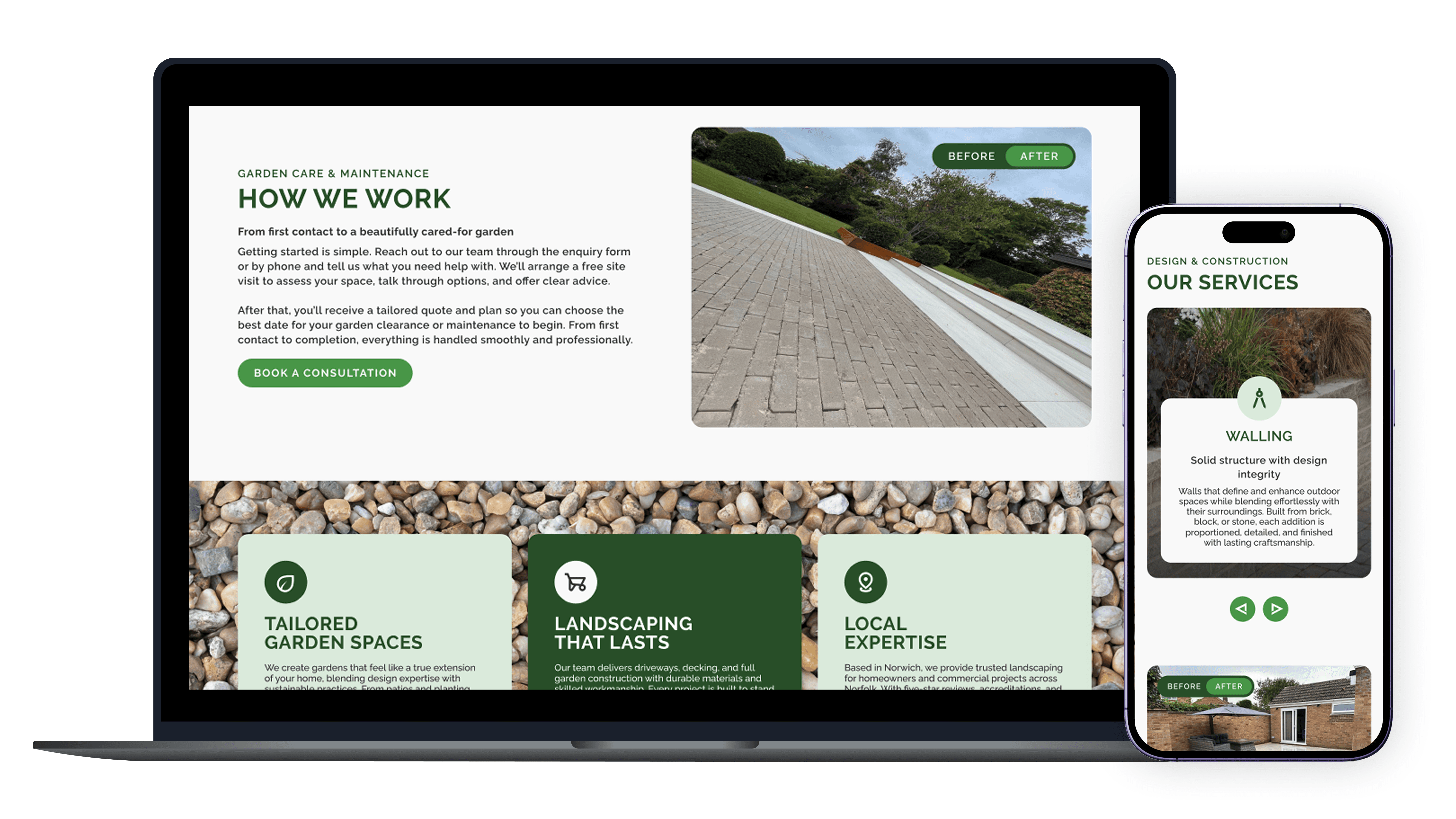
The Solution
The final website positioned Totally Landscapes as a clear, professional service provider with a structured and trustworthy digital presence.
The final website positioned Totally Landscapes as a clear, professional service provider with a structured and trustworthy digital presence.
The final website positioned Totally Landscapes as a clear, professional service provider with a structured and trustworthy digital presence.
Services were organised into logical categories supported by consistent layouts and confident visual storytelling. Content focused on outcomes, expertise and next steps rather than internal terminology. The result was a calmer, more intuitive experience that helped users quickly understand offerings, build confidence and move naturally toward enquiry.
Services were organised into logical categories supported by consistent layouts and confident visual storytelling. Content focused on outcomes, expertise and next steps rather than internal terminology. The result was a calmer, more intuitive experience that helped users quickly understand offerings, build confidence and move naturally toward enquiry.
Services were organised into logical categories supported by consistent layouts and confident visual storytelling. Content focused on outcomes, expertise and next steps rather than internal terminology. The result was a calmer, more intuitive experience that helped users quickly understand offerings, build confidence and move naturally toward enquiry.