Indigo Dyslexia
Indigo Dyslexia
This project focused on designing a clear, inclusive digital booking experience for specialist dyslexia and dyscalculia assessments.
PROJECT TYPE
2026
Scope
Branding
Timeline
12 weeks

The Challenge
Diagnostic assessment services are inherently complex and emotionally charged. Users often arrive anxious, unsure which assessment is appropriate, and unclear about what happens next.
Diagnostic assessment services are inherently complex and emotionally charged. Users often arrive anxious, unsure which assessment is appropriate, and unclear about what happens next.
Diagnostic assessment services are inherently complex and emotionally charged. Users often arrive anxious, unsure which assessment is appropriate, and unclear about what happens next.
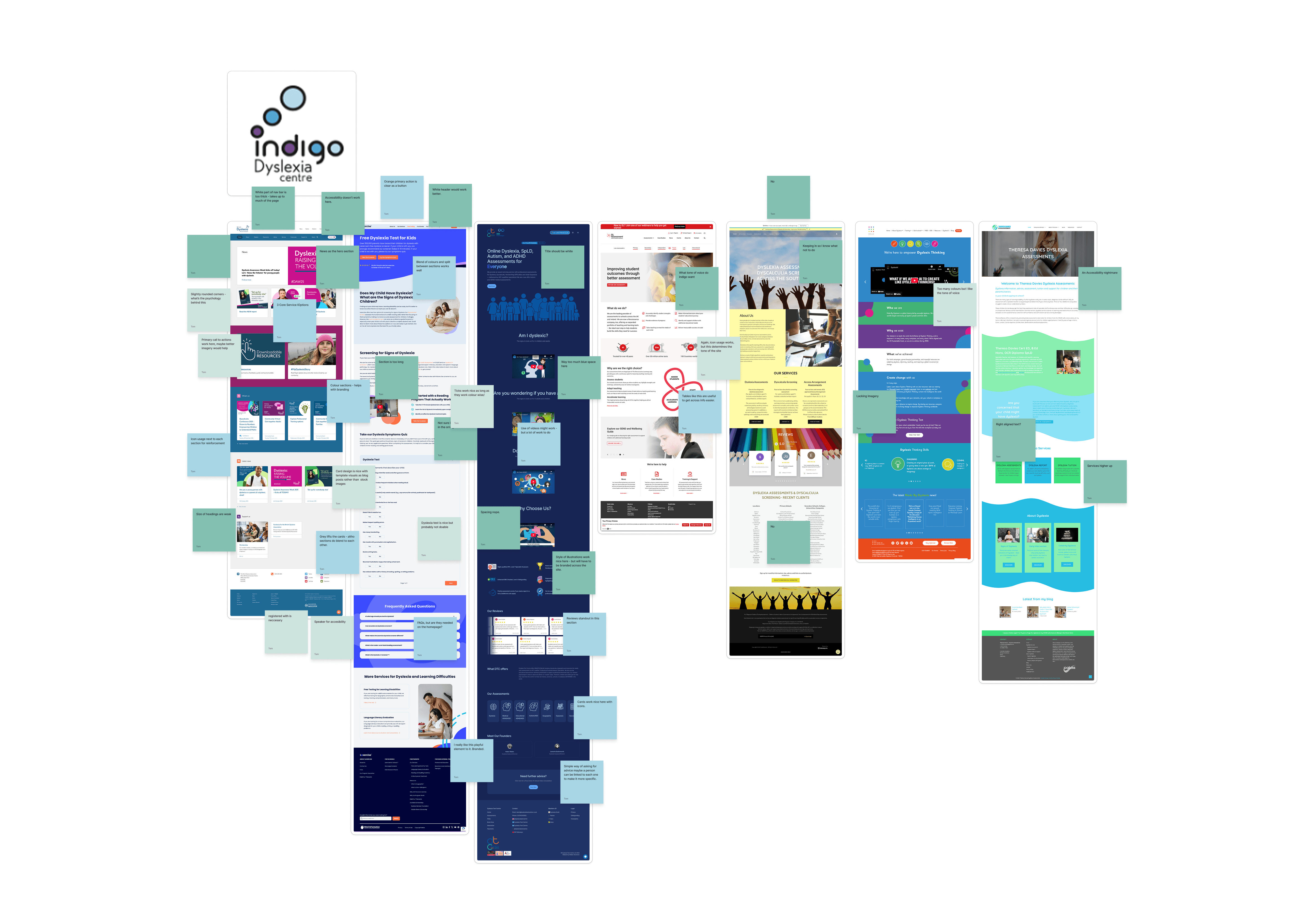
Existing sector solutions rely heavily on long form explanations and technical language, which can increase cognitive load and hesitation. The challenge was to design an experience that explains complex services clearly, supports decision making, and reduces anxiety, all while maintaining trust and professional authority.
Existing sector solutions rely heavily on long form explanations and technical language, which can increase cognitive load and hesitation. The challenge was to design an experience that explains complex services clearly, supports decision making, and reduces anxiety, all while maintaining trust and professional authority.
Existing sector solutions rely heavily on long form explanations and technical language, which can increase cognitive load and hesitation. The challenge was to design an experience that explains complex services clearly, supports decision making, and reduces anxiety, all while maintaining trust and professional authority.

Uncertainty Before Action
Research showed that hesitation often came from unclear service distinctions and lack of transparency around process and outcomes, not from price or availability.

Multiple User Types With Different Needs
Parents, schools, and employers approach assessment booking with different goals, timescales, and levels of prior knowledge. A single linear journey failed to support all three effectively.

Accessibility as a Core Requirement
Designing for neurodiverse users highlighted the importance of readability, predictable interaction patterns, and visual calm throughout the journey.
Audience and Insights
Audience and Insights
Multiple User Types With Different Needs
An Experience That Felt Fragmented
Parents, schools, and employers approach assessment booking with different goals, timescales, and levels of prior knowledge. A single linear journey failed to support all three effectively.
Parents, schools, and employers approach assessment booking with different goals, timescales, and levels of prior knowledge. A single linear journey failed to support all three effectively.
Uncertainty Before Action
Unclear Conversion Pathways
Research showed that hesitation often came from unclear service distinctions and lack of transparency around process and outcomes, not from price or availability.
Research showed that hesitation often came from unclear service distinctions and lack of transparency around process and outcomes, not from price or availability.
Accessibility as a Core Requirement
Outdated Structure and Limited Clarity
Designing for neurodiverse users highlighted the importance of readability, predictable interaction patterns, and visual calm throughout the journey.
Designing for neurodiverse users highlighted the importance of readability, predictable interaction patterns, and visual calm throughout the journey.
IDEATION AND APPROACH
Ideation centred on structuring information to support understanding before action.
Ideation centred on structuring information to support understanding before action.
Ideation centred on structuring information to support understanding before action.
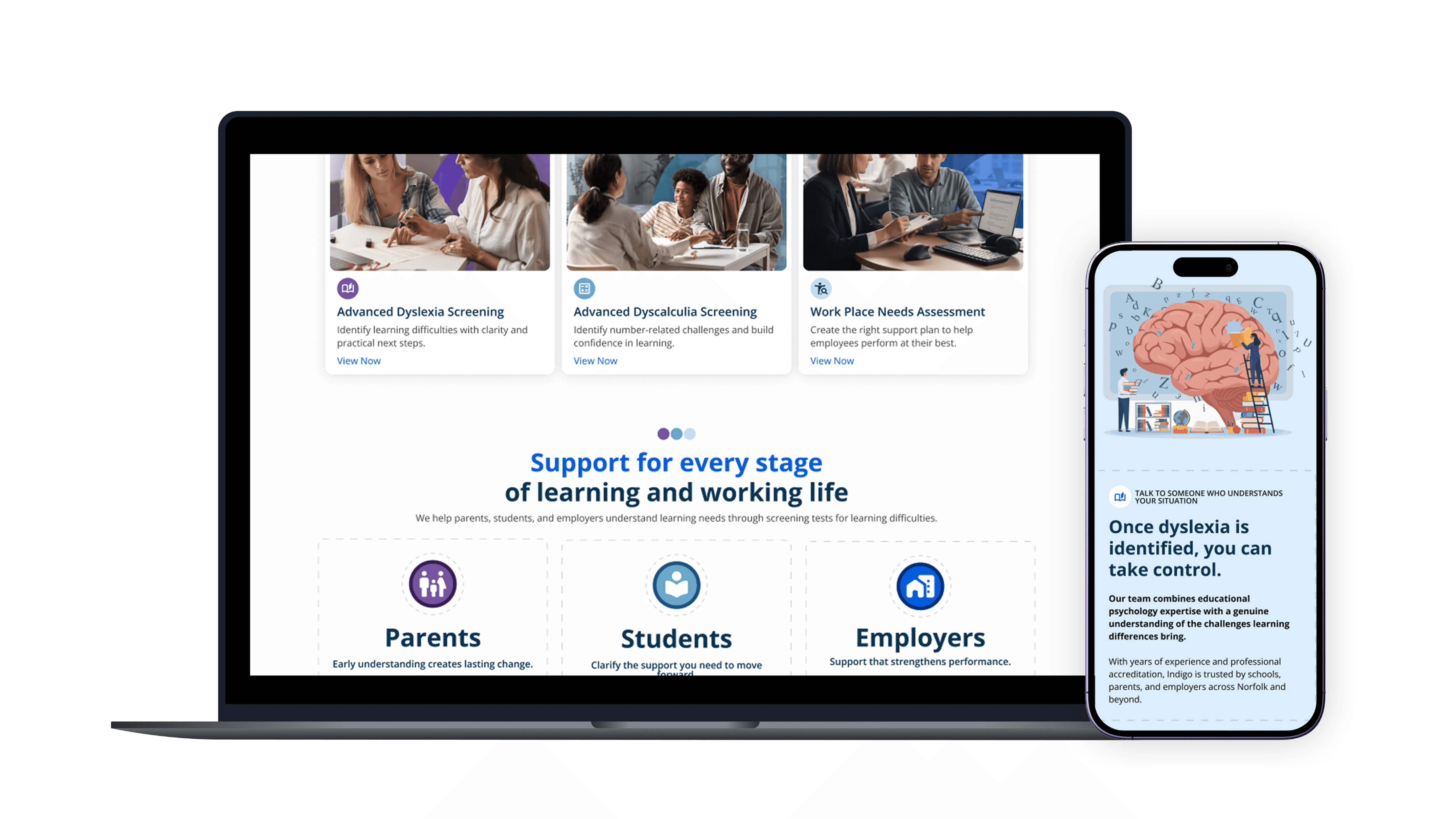
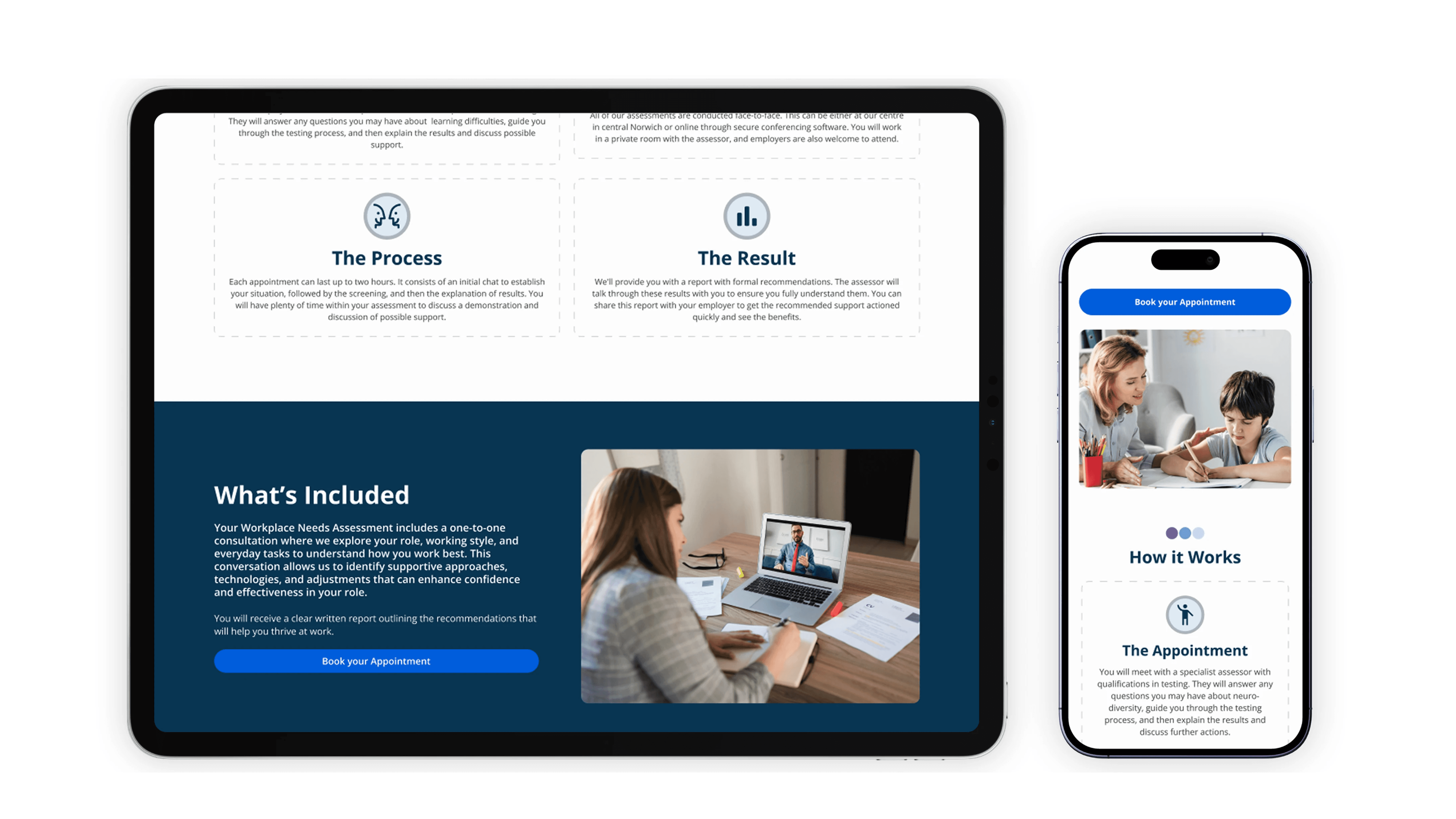
Early concepts focused on clearly segmented pathways that allow users to quickly identify relevance while retaining access to deeper detail when needed. Progressive disclosure became a key principle, ensuring users were never overwhelmed but always supported. The booking journey was treated as a guided process rather than a transactional form, helping users feel confident at each step.
Early concepts focused on clearly segmented pathways that allow users to quickly identify relevance while retaining access to deeper detail when needed. Progressive disclosure became a key principle, ensuring users were never overwhelmed but always supported. The booking journey was treated as a guided process rather than a transactional form, helping users feel confident at each step.
Early concepts focused on clearly segmented pathways that allow users to quickly identify relevance while retaining access to deeper detail when needed. Progressive disclosure became a key principle, ensuring users were never overwhelmed but always supported. The booking journey was treated as a guided process rather than a transactional form, helping users feel confident at each step.
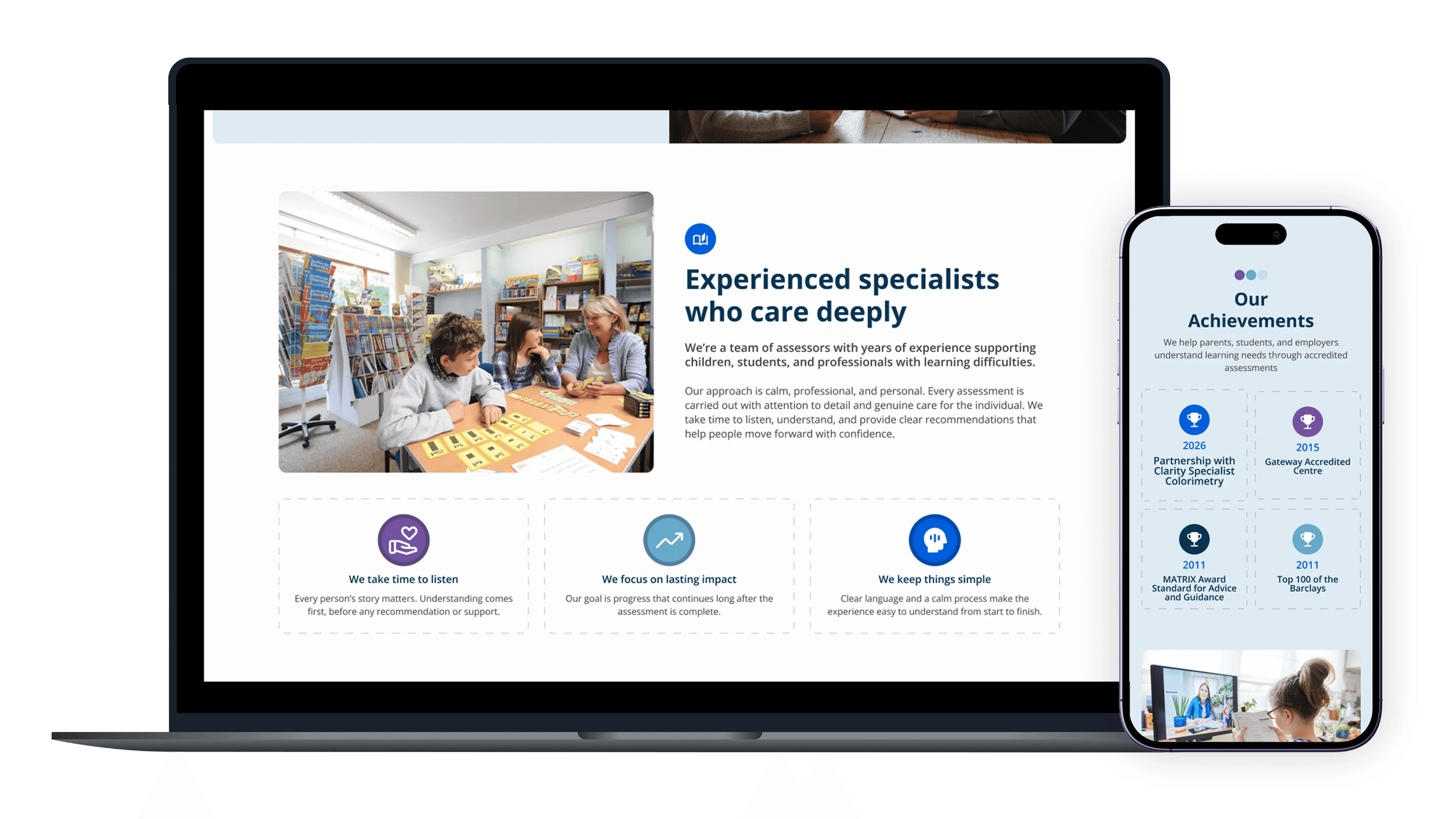
The visual system was intentionally calm and neutral to reduce cognitive strain and keep focus on the primary task. Soft, muted colour palettes were chosen to create reassurance rather than urgency, allowing content and actions to lead the experience. Dashed lines and subtle directional cues were used as gentle guides through pages and forms, helping users maintain focus and understand progression without relying on heavy instruction. Clear hierarchy, generous spacing, and consistent typography supported scanning and readability, particularly for users with dyslexia or dyscalculia.
The visual system was intentionally calm and neutral to reduce cognitive strain and keep focus on the primary task. Soft, muted colour palettes were chosen to create reassurance rather than urgency, allowing content and actions to lead the experience. Dashed lines and subtle directional cues were used as gentle guides through pages and forms, helping users maintain focus and understand progression without relying on heavy instruction. Clear hierarchy, generous spacing, and consistent typography supported scanning and readability, particularly for users with dyslexia or dyscalculia.
I introduced a structured research and testing process, using early validation and rapid iteration to guide decisions, reduce risk and ensure the experience evolved around real user behaviour rather than assumptions.
Testing and Evaluation
Testing and Evaluation
48%
Clearer Understanding of Assessment Types
Improved content structure and progressive disclosure helped users distinguish between services without needing external support.
41%
Increased Confidence Before Booking
Users reported feeling more assured about suitability, process, and next steps before submitting enquiries.
63%
Smoother Task Completion
Predictable layouts and guided form structure reduced friction and cognitive effort during booking.
29%
Faster Product Configuration
Users completed custom kit builds more quickly once options were grouped into clear stages, reducing backtracking and hesitation during high-commitment steps.
22%
Increase in Completed Enquiries
Introducing clearer reassurance points and a structured journey improved confidence, leading to more users completing enquiries without dropping out.
38%
Improvement in Product Understanding
Clearer hierarchy, progressive disclosure and consistent specifications helped users understand differences between options and make decisions with greater certainty.

The Solution
The final experience reframed assessment booking as a calm, guided journey built around trust, clarity, and inclusivity.
The final experience reframed assessment booking as a calm, guided journey built around trust, clarity, and inclusivity.
The final experience reframed assessment booking as a calm, guided journey built around trust, clarity, and inclusivity.
By combining structured information, accessible design choices, and gentle visual guidance, the platform supports users through a complex decision with confidence. This project demonstrates how UX design can reduce anxiety, improve comprehension, and make specialist services more approachable when accessibility and trust are treated as foundational rather than secondary considerations.
By combining structured information, accessible design choices, and gentle visual guidance, the platform supports users through a complex decision with confidence. This project demonstrates how UX design can reduce anxiety, improve comprehension, and make specialist services more approachable when accessibility and trust are treated as foundational rather than secondary considerations.
By combining structured information, accessible design choices, and gentle visual guidance, the platform supports users through a complex decision with confidence. This project demonstrates how UX design can reduce anxiety, improve comprehension, and make specialist services more approachable when accessibility and trust are treated as foundational rather than secondary considerations.