East Bilney Lakes
This project involved creating the East Bilney Lakes visual identity from scratch, building a calm, nature led brand system rooted in hand drawn illustration and tactile design. The identity brings together the lakeside café and stays under one cohesive visual language, designed to feel welcoming, thoughtful, and closely connected to its natural surroundings while remaining flexible across print, digital, and on site applications.
This project involved creating the East Bilney Lakes visual identity from scratch, building a calm, nature led brand system rooted in hand drawn illustration and tactile design. The identity brings together the lakeside café and stays under one cohesive visual language, designed to feel welcoming, thoughtful, and closely connected to its natural surroundings while remaining flexible across print, digital, and on site applications.
This project involved creating the East Bilney Lakes visual identity from scratch, building a calm, nature led brand system rooted in hand drawn illustration and tactile design. The identity brings together the lakeside café and stays under one cohesive visual language, designed to feel welcoming, thoughtful, and closely connected to its natural surroundings while remaining flexible across print, digital, and on site applications.

Keeping Nature at the Core
Keeping Nature at the Core

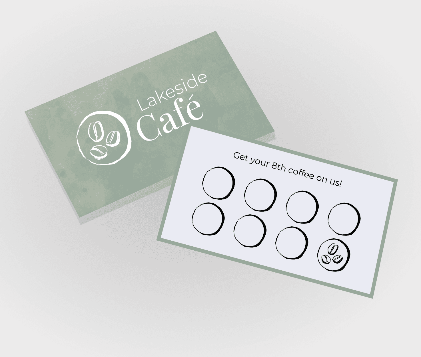
Hand Drawn Illustration System
A bespoke set of over 100 hand drawn illustrations was created to capture the character of lakeside life, from wildlife and foliage to food and everyday moments, introducing warmth, charm, and a sense of craft throughout the brand.

Natural Colour Palette
A muted, earthy colour palette inspired by the surrounding landscape was developed to create a calm and grounded feel, using soft greens, clay tones, and natural neutrals to support imagery without overpowering it.

Typography with Soft Contrast
A considered typographic pairing balances elegant display type with clean supporting text, allowing messaging to feel refined yet approachable while maintaining clarity across signage, menus, and digital content.
Hand Drawn Illustration System
A Performance Led Brand System
A bespoke set of over 100 hand drawn illustrations was created to capture the character of lakeside life, from wildlife and foliage to food and everyday moments, introducing warmth, charm, and a sense of craft throughout the brand.
A bespoke set of over 100 hand drawn illustrations was created to capture the character of lakeside life, from wildlife and foliage to food and everyday moments, introducing warmth, charm, and a sense of craft throughout the brand.
Natural Colour Palette
Controlled Colour and Contrast
A muted, earthy colour palette inspired by the surrounding landscape was developed to create a calm and grounded feel, using soft greens, clay tones, and natural neutrals to support imagery without overpowering it.
A muted, earthy colour palette inspired by the surrounding landscape was developed to create a calm and grounded feel, using soft greens, clay tones, and natural neutrals to support imagery without overpowering it.
Typography with Soft Contrast
Imagery Driven by Real Movement
A considered typographic pairing balances elegant display type with clean supporting text, allowing messaging to feel refined yet approachable while maintaining clarity across signage, menus, and digital content.
A considered typographic pairing balances elegant display type with clean supporting text, allowing messaging to feel refined yet approachable while maintaining clarity across signage, menus, and digital content.
A Unified Lakeside Identity
A Unified Lakeside Identity
Every element of the East Bilney Lakes identity is designed to work quietly together, with illustration, colour, and typography supporting the experience rather than competing for attention.
Every element of the East Bilney Lakes identity is designed to work quietly together, with illustration, colour, and typography supporting the experience rather than competing for attention.
Every element of the East Bilney Lakes identity is designed to work quietly together, with illustration, colour, and typography supporting the experience rather than competing for attention.
The hand drawn system allows the brand to scale naturally across café and stays without feeling commercial or rigid, creating a visual language that feels personal, consistent, and closely tied to place. The result is a brand that invites people to slow down, settle in, and feel part of the lakeside environment from the first interaction to the last.
The hand drawn system allows the brand to scale naturally across café and stays without feeling commercial or rigid, creating a visual language that feels personal, consistent, and closely tied to place. The result is a brand that invites people to slow down, settle in, and feel part of the lakeside environment from the first interaction to the last.
The hand drawn system allows the brand to scale naturally across café and stays without feeling commercial or rigid, creating a visual language that feels personal, consistent, and closely tied to place. The result is a brand that invites people to slow down, settle in, and feel part of the lakeside environment from the first interaction to the last.