Baller League
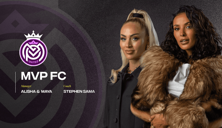
This project focused on translating the Baller League brand into a high impact ecommerce and content driven website, balancing entertainment, merchandise, and competition storytelling within a single digital experience. The design applies bold brand patterns, expressive colour, and strong hierarchy to support fast scanning, product discovery, and constant content updates without overwhelming the user.
This project focused on translating the Baller League brand into a high impact ecommerce and content driven website, balancing entertainment, merchandise, and competition storytelling within a single digital experience. The design applies bold brand patterns, expressive colour, and strong hierarchy to support fast scanning, product discovery, and constant content updates without overwhelming the user.
This project focused on translating the Baller League brand into a high impact ecommerce and content driven website, balancing entertainment, merchandise, and competition storytelling within a single digital experience. The design applies bold brand patterns, expressive colour, and strong hierarchy to support fast scanning, product discovery, and constant content updates without overwhelming the user.

Built for Pace and Impact
Built for Pace and Impact

Brand Patterns as Structure
Strong graphic motifs, diagonal accents, and high contrast colour blocks are used consistently to separate content types, guide attention, and create rhythm across dense layouts, ensuring the brand remains recognisable while supporting clarity.

Product and Content Led Hierarchy
The layout prioritises merchandise and key league moments through clear visual hierarchy, allowing users to quickly move between shop items, team content, and featured drops without losing context.

Designed for Speed and Scanning
Bold typography, modular cards, and repeatable components support rapid scanning across large product grids and promotional sections, reducing friction in browsing and helping users reach decisions quickly.
Brand Patterns as Structure
A Performance Led Brand System
Strong graphic motifs, diagonal accents, and high contrast colour blocks are used consistently to separate content types, guide attention, and create rhythm across dense layouts, ensuring the brand remains recognisable while supporting clarity.
Strong graphic motifs, diagonal accents, and high contrast colour blocks are used consistently to separate content types, guide attention, and create rhythm across dense layouts, ensuring the brand remains recognisable while supporting clarity.
Product and Content Led Hierarchy
Controlled Colour and Contrast
The layout prioritises merchandise and key league moments through clear visual hierarchy, allowing users to quickly move between shop items, team content, and featured drops without losing context.
The layout prioritises merchandise and key league moments through clear visual hierarchy, allowing users to quickly move between shop items, team content, and featured drops without losing context.
Designed for Speed and Scanning
Imagery Driven by Real Movement
Bold typography, modular cards, and repeatable components support rapid scanning across large product grids and promotional sections, reducing friction in browsing and helping users reach decisions quickly.
Bold typography, modular cards, and repeatable components support rapid scanning across large product grids and promotional sections, reducing friction in browsing and helping users reach decisions quickly.
The Baller League website demonstrates how a strong brand system can actively shape usability rather than sit on top of it.
The Baller League website demonstrates how a strong brand system can actively shape usability rather than sit on top of it.
The Baller League website demonstrates how a strong brand system can actively shape usability rather than sit on top of it.
Visual patterns, colour, and layout rules are used to manage high volumes of content while maintaining clarity and pace. This approach allows the platform to scale across drops, seasons, and campaigns, creating an ecommerce experience that feels energetic, controlled, and unmistakably Baller League while keeping product and engagement at the centre of the journey.
Visual patterns, colour, and layout rules are used to manage high volumes of content while maintaining clarity and pace. This approach allows the platform to scale across drops, seasons, and campaigns, creating an ecommerce experience that feels energetic, controlled, and unmistakably Baller League while keeping product and engagement at the centre of the journey.
Visual patterns, colour, and layout rules are used to manage high volumes of content while maintaining clarity and pace. This approach allows the platform to scale across drops, seasons, and campaigns, creating an ecommerce experience that feels energetic, controlled, and unmistakably Baller League while keeping product and engagement at the centre of the journey.